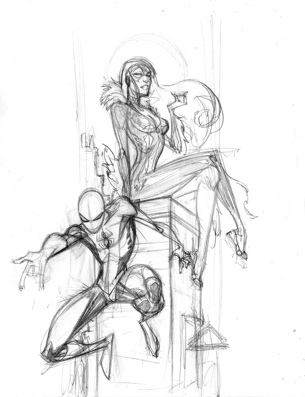
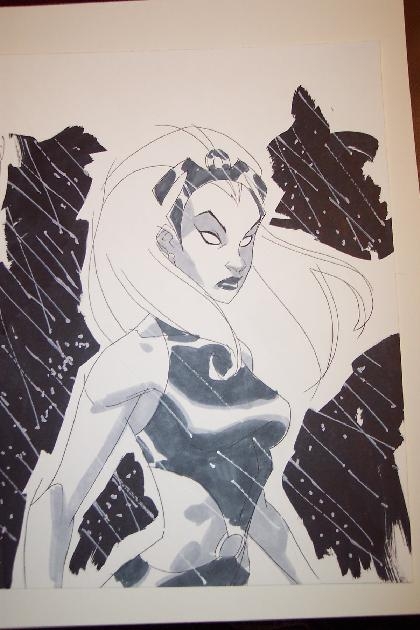
Can't speak too much at the moment, got a ton of stuff and no time to do it. So here you go y'all, a few con sketches and a few sketches just for the hell of it. Holla!
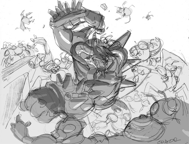
Since this is my sketchblog, I figure I should show you guys some actual artwork, right? Ok. So this is something I plan on showing from time to time, the process that goes into creating some of the artwork I do. This particular piece is card artwork done for Chaotic, the property seen in my very first post. The character is Chaor, who is basically the baddest sumbitch in all of Chaotic. Don't mess with Chaor. So I start off every card by submitting a few different sketches and letting the client pick which one they wanna roll with. As you can see I try to stay very rough and loose with my sketches. One, because I'm really just trying to workout the composition and the design of the card. And two, I want the client to try and really feel the emotion and energy of what the final card will look like. If I went too clean and tight the lineart would start to stiffen up and would get even stiffer when I went to final cleanup.
After I did the quick pencil sketches I would go in and laydown some very quick greytones so that the sketches would be more legible to the client. It also helps me understand what kind of mood I would like to go for with the piece and it also helps the colorist as well so that we're both on the same page.
The client wound up preferring the second image because they felt that the first one was too busy and they wanted more of the focus to be on the character himself. Next up is the clean lineart itself. I always have the most fun in this stage. Once the layout and composition is finalized, putting in all the details and crap is the easy part. You'll notice that I changed the character's body type significantly. I just didn't feel like he felt powerful enough with those tiny little legs of his, so I beefed him up and really tried to add some weight and mass to him. I specifically wanted his arms and his legs to look very "heavy," so if this dude hit you. . .well, you'd really feel it. It's stuff like that that really makes the character seem believable, even if it's completely made up. The background also changed some. The client wanted to highlite that this dude wasn't all brawn and had some magic capabilities so we decided to have him controlling the earth and raising lava geysers outta the ground. I didn't put any detail into the geysers themselves because I knew that they would be better represented by the color. One step I neglected to put in was the blue line stage of the lineart. When I do the clean line art, I start off with a blue pencil to rough in the lineart and get all the anatomy and and other stuff laid down. It's very messy. Once that is done I then go over the blue line with either an F or an HB pencil with a clean line. What this done is similar to inking, where I go for as clean and dark a line as possible. I use these specific pencils because the lead is still somewhat hard, but it's also a nice, crisp, dark line. After that is completed I then scan the lineart in and subtract the blue line via Photoshop and all that is left is the dark line. Voila. And now, the coolest part of all: the color. I got one of my most favorite of colorists, Tony Washington, to lay down the hues, and once again he really added another dimension to this piece and really brought it to life. Before T begins, he and I discuss what story needs to be told with the color and how we need to accomplish it. There are always somethings I want to tell, some he wants to tell, and some things the client wants, so it's always a bit of compromise on everyone's end. I wanted the underlighting that I previously laid down in the sketch, and T nailed it. He also added some incredible atmosphere with the earth texturing and the lava and really added a nice depth to it by making the air behind Chaor very thick. It really gives you the feeling that this guy is 100% evil. I was really happy with the way the color came out.
And finally, corrections. There is almost always something that is asked for by the client to be changed. No matter how hard you try, it's a fact of life. The best you can hope for is that the corrections are minimal. Thankfully in this case they were. 4kids felt that his head, while dramatic, did not read clearly enough, especially since these images would be shrunk down to fit on a trading card. With stuff like this the operative word is "clarity," so if it doesnt read well at full size, it definitely will not read well on a card. So I redid his head. The only other real correction was that 4kids felt Chaor was a little too dark, so T went in and brightened him up a tad. Once that was done, it was a wrap. And there you have it.
Whattup y'all. Just sending out a quick reminder to let everyone know that Hellboy: Blood and Stone will be airing tomorrow (saturday) on Cartoon Network at 7pm. I didn't do much on the show, but I DID get to design one of the two main villains. If you watch, check out Erszebet. . . . that's all me, brotha.
So, I finally, finally did it. I made an "official" blog. Not that I didn't have them before. I mean, I've had one on kharupt.com for years. And I have one on myspace. But till now I haven't been a part of the blog "community". And I felt a lil' left out. So here I be. And this is my first post. So, this being my first post, for those who don't know who I am, let me give you the short version. I'm Khary Randolph. I live in New York. I draw stuff for a living. I've done lots of work for companies like Marvel, DC, Image, Sony, 4kids, blah blah blah. And I love what I do. Every once in a while I crawl out of my little upper east side apartment (affectionately called The Hatch by me and my girl because it's dark and red and kinda looks like The Hatch from Lost) and go to comic book conventions. I go to these things 1) because it's one of the only times when I get to vibe with other creators and get amped up on all the amazing art; 2) I like to meet the fans and get honest reactions to the art; 3) and I say this with no shame whatsoever -- I make good money there. So with all that in mind, I did the New York Comicon February 23-35th, 2007. This one was a big one for me because it was the first time I had ever done signings at tables other than my own. I spent time at both the 4kids/Chaotic booth and at the McFarlane/Spawn. It was a -- wait. Stop. Let's cut all the blogginess out. Just look at the pictures already.
The line. You can't really tell but this extended for blocks. And it was really, really cold outside.
That's my artwork for Chaotic. It was posted on every door of the Javitz Center. Not bad, right?
Me at my table. Notice the ashy hands of someone who washes his hands way too much. And the bagel crumbs in my lap. Pimp.
The Chaotic booth.My art.
Yup. Mine too.
Oh look is that? Yup. Mine.
Signing autographs.
Preaching the truth to the youth.
Me and Spawn writer Jon Goff at the Mcfarlane booth.
Me, Lesean Thomas, and a Pop Culture Shock girl. My good friend Lawrence Christmas. He's an angry black man.Andrew Bell, of Creatures in My Head. Yeah, he's gangsta like that.Me and my childhood homeboy Amit. She will probably kill me the next con I see her, but I cannot remember this girl's name for the life of me. Nonetheless, she was very cool and you should all go buy the book she's promoting.The fruits of a hard day's work. Holla!
Much thanx to everyone who contributed pictures to this blog. You guys keep me lookin' oh so pretty!


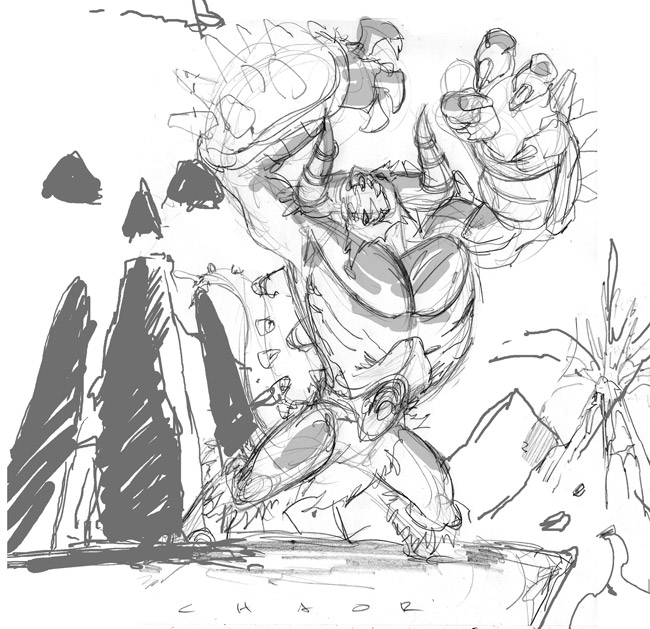 As you can see I try to stay very rough and loose with my sketches. One, because I'm really just trying to workout the composition and the design of the card. And two, I want the client to try and really feel the emotion and energy of what the final card will look like. If I went too clean and tight the lineart would start to stiffen up and would get even stiffer when I went to final cleanup.
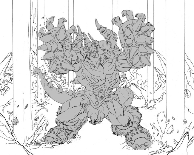
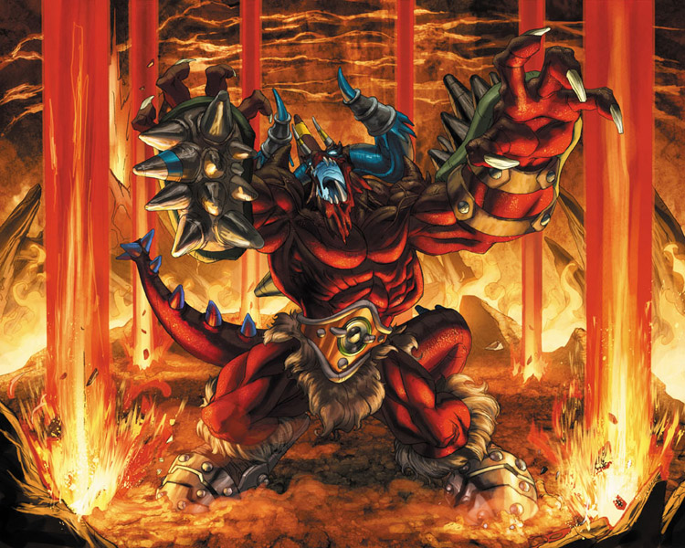 And now, the coolest part of all: the color. I got one of my most favorite of colorists, Tony Washington, to lay down the hues, and once again he really added another dimension to this piece and really brought it to life. Before T begins, he and I discuss what story needs to be told with the color and how we need to accomplish it. There are always somethings I want to tell, some he wants to tell, and some things the client wants, so it's always a bit of compromise on everyone's end. I wanted the underlighting that I previously laid down in the sketch, and T nailed it. He also added some incredible atmosphere with the earth texturing and the lava and really added a nice depth to it by making the air behind Chaor very thick. It really gives you the feeling that this guy is 100% evil. I was really happy with the way the color came out.
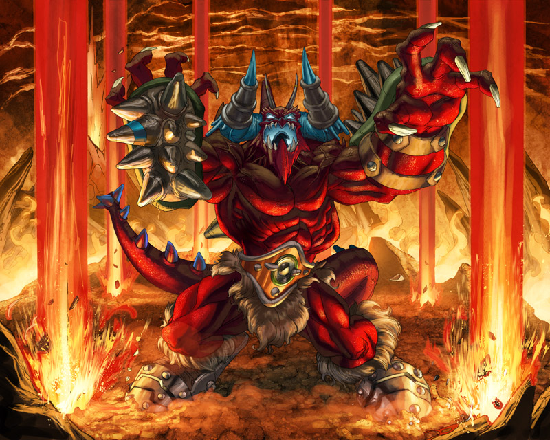 And finally, corrections. There is almost always something that is asked for by the client to be changed. No matter how hard you try, it's a fact of life. The best you can hope for is that the corrections are minimal. Thankfully in this case they were. 4kids felt that his head, while dramatic, did not read clearly enough, especially since these images would be shrunk down to fit on a trading card. With stuff like this the operative word is "clarity," so if it doesnt read well at full size, it definitely will not read well on a card. So I redid his head. The only other real correction was that 4kids felt Chaor was a little too dark, so T went in and brightened him up a tad. Once that was done, it was a wrap. And there you have it.
 The line. You can't really tell but this extended for blocks. And it was really, really cold outside.
 That's my artwork for Chaotic. It was posted on every door of the Javitz Center. Not bad, right?
 Me at my table. Notice the ashy hands of someone who washes his hands way too much.
 The Chaotic booth.
 My art.
 Yup. Mine too.
 Oh look is that? Yup. Mine.
 Signing autographs.
 Preaching the truth to the youth.
 Me and Spawn writer Jon Goff at the Mcfarlane booth.
 Me, Lesean Thomas, and a Pop Culture Shock girl.
 My good friend Lawrence Christmas. He's an angry black man.
 Andrew Bell, of Creatures in My Head. Yeah, he's gangsta like that.
 Me and my childhood homeboy Amit.
  She will probably kill me the next con I see her, but I cannot remember this girl's name for the life of me. Nonetheless, she was very cool and you should all go buy the book she's promoting.
 The fruits of a hard day's work. Holla!

