
Tuesday, November 27, 2007
Wednesday, November 7, 2007
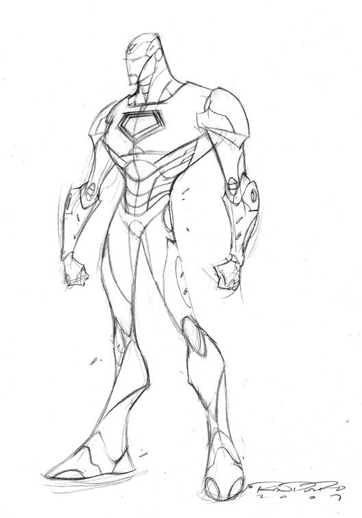
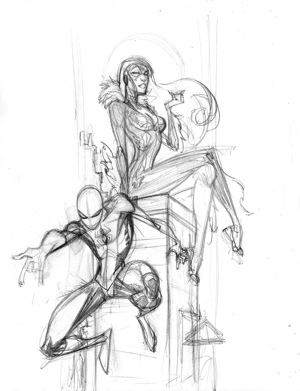
Ironman.
I've wanted to do my version of Adi Granov's Ironman for quite a while now. I did this as a warm up before working on a page of Spawn. I may try to do this more often, I dont sketch nearly enough these days.
Don't post nearly enough either, but you already know that.
Don't post nearly enough either, but you already know that.
Monday, October 22, 2007
Bowery Poetry Club
Another week, another party! If you're in NYC this Friday, this is the spot you need to be at. There'll be poetry, dope music, and a projector slideshow featuring artwork by yours truly. So come thru, it'll be a good time. There will of course be copies of the Black Book and t-shirts for sale (yes, I am one hell of a self promoter). Props to my man Chuck for the hook-up.

Wednesday, October 17, 2007
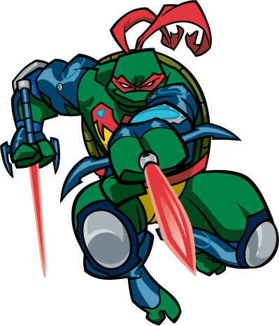
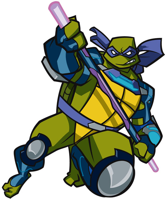
Turtles of Future Past
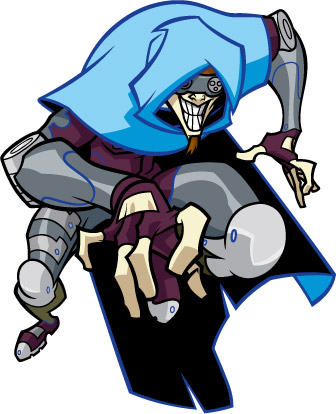
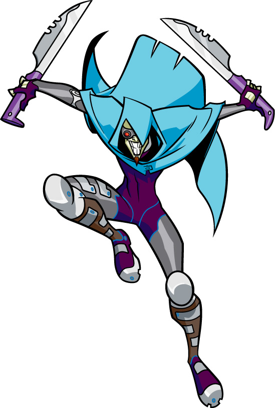
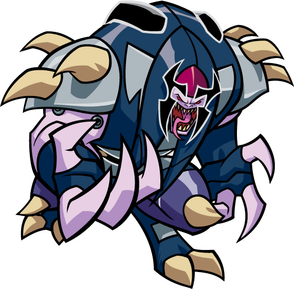
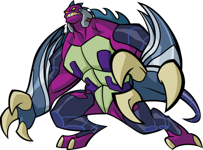
So, I was going through my archives, and noted that some of these TMNT: Fast Forward joints I've done a while ago have never really been shown. Let me rephrase that -- a few of these have been shown on toy shelves via packaging and what not, they just haven't ever been show by me. And, some of these are aborted character tryouts that for whatever reason didn't work or didn't fit character specs or whatever. Shokanobo himself (big guy w/ the tongue) as a drawing was fine, but the colors changed from this version to final. So here they are.

Thursday, October 4, 2007
Kano VS. Kharupt: To the DEATH.
This is straight up, 100% the last time I will mention this book in this blog. For realz. Honest.
That said, if you're in the NYC region and you wanna come thru by all means do so. It should be a good time.

That said, if you're in the NYC region and you wanna come thru by all means do so. It should be a good time.
Saturday, September 29, 2007
Still alive.
I swear, I will be updating this damn thing soon. I have a ton of stuff to put up here, but things have been so hectic I just haven't had the time to put it all up. That will change soon, promise. Within the week. Stay tuned.
Wednesday, August 29, 2007
THE BLACK BOOK IS NOW AVAILABLE.

Thas' right. The book is now available for purchase online from Kharupt.com. It's been a long time coming. So go get yerself a copy. You won't regret.
It's been a minute since I've had a chance to update my blog(s) because the month of August has been an extremely busy one. One weekend at the San Diego Comicon, the next in Boston, the next after that at Wizard World Chicago, and then a week later in Nassau, Bahamas. Yes, I racked up quite a bit of frequent flyer miles. I have plenty to talk about and many a picture to share, but all that can wait for a bit so I can reiterate the point of this blog entry -- *ahem* -- THE BLACK BOOK IS NOW AVAILABLE. The book will get nationwide distribution later on in the year, but I'd like to get the book into the hands of the people that really, really want the book now. Plus, getting the books from me directly is the only way you're gonna get em signed. 48 pages of hard cover, full color femininity and curves by yours truly. Just click on the link. Holla back.
Oh, and one more thing -- the first 20 people that order will get a special little something extra from me. ;)
Monday, August 6, 2007
Wizard World Chicago
So, San Diego was a blast. I had lots of fun, saw lots of friends I haven't seen in quite a while, and also made some good contacts which will hopefully pan out in the future. I'll have some pictures up soon, I'm just waiting for a few pics that other people took, and I'll post em up when I get those. That said, my summer convention tour continues as later on this week I will be in the Windy City for Wizard World Chicago August 9-12th. Unlike SDCC, I will actually have a table in Artist Alley. I'll be signing books, selling copies of the Black Book, pushing prints, and doing sketches for whoever wants em. A warning, however -- the sketchlist does get filled kinda quickly, so if you wanna get one I would suggest you get there early. Just sayin'. So swing by and holla atcha boy, it'll be all types of fun.
Also, here is a piece that I did right before the San Diego show. Literally. As in, it was completed a day before I left. It was done specifically for the show as a raffle giveaway at the 4kids/Chaotic booth.

Also, here is a piece that I did right before the San Diego show. Literally. As in, it was completed a day before I left. It was done specifically for the show as a raffle giveaway at the 4kids/Chaotic booth.
Monday, July 9, 2007
SDCC
What's good y'all. Just to let y'all know, I decided at a very late date that I WILL be attending the San Diego Comicon (July 26th-29). Because I made the decision at such a late date, I do not have a table there. BUT. . .The Black Book WILL be available for purchase at the Brandstudio Press table. It will retail at $25 and I promise you it will be worth it. I got a preview copy a few weeks ago and it looks ****ing sick. I will also be signing at a few different tables while I'm there. I'll be at the 4kids/Chaotic table from 5-6pm on Friday and 1-2/2:30 on Saturday. I'll also be at the McFarlane table from 3-4pm on Saturday. So swing by and holla atcha boy.
And while I'm here, a few commissions I've finished up recently, Gambit and Sleepwalker. They are for the same fellow but I wanted to do two slightly different style techniques since the characters are so different. Peace.
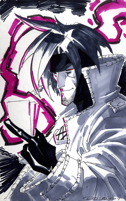
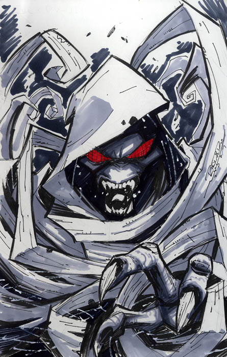
And while I'm here, a few commissions I've finished up recently, Gambit and Sleepwalker. They are for the same fellow but I wanted to do two slightly different style techniques since the characters are so different. Peace.
Monday, June 4, 2007
Black Book and more.
Real quick, cuz I got a million things to do. . . let us go down the list, shall we?
The cover to The Black Book. It's gone to print, bitches.
 TMNT Season 1. This is the cover to the DVD, sans type and all that.. It's out now, I believe.
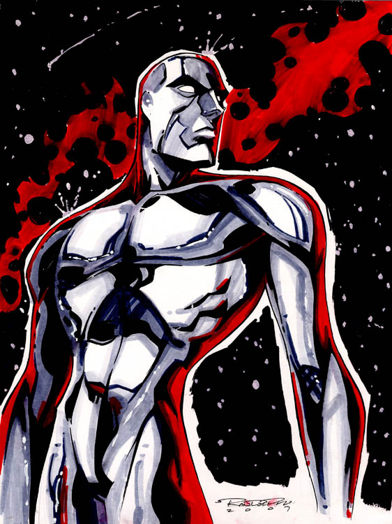
 Next up, a few commissions that I've owed the owners just about forever. Silver Surfer and Northstar. Sorry about the wait, guys.

Konichiwa, au revoir, and holla back!
The cover to The Black Book. It's gone to print, bitches.
TMNT Season 1. This is the cover to the DVD, sans type and all that.. It's out now, I believe.Next up, a few commissions that I've owed the owners just about forever. Silver Surfer and Northstar. Sorry about the wait, guys.Konichiwa, au revoir, and holla back!
Thursday, May 3, 2007
The Black Book
Okay. So, most people at this point know that I like to draw women. I really do. There is no big Freudian reason to why I like drawing them so much (well, I'm sure there probably is, but whatever), but pretty much since my hormones went into overdrive I've been drawing lots and lots of women. That said, recently my good friend (and artist extraordinaire) Alberto Ruiz asked me if I wanted to do an artbook that he would publish. Cue lightbulb above head. So for the past couple of months, I've been secretly working on an artbook. Of. . .you guessed it. I've been wanting to do one for the longest time but never had the resources, time, drive or balls to make it happen. Thanx to Mr. Ruiz, I at least have the balls part.
The name of my project is The Black Book. It will be a full color, 48 page hardcover artbook full of lovely ladies of all shapes, sizes and color. I'm maybe 85% done and super psyched about it. I hope to have it done and available for SDCC (hopefully) and Wizard World Chicago (definitely). After that, in stores and available thru Kharupt.com. I will share more info later, but until then, here are a few sneak peeks.

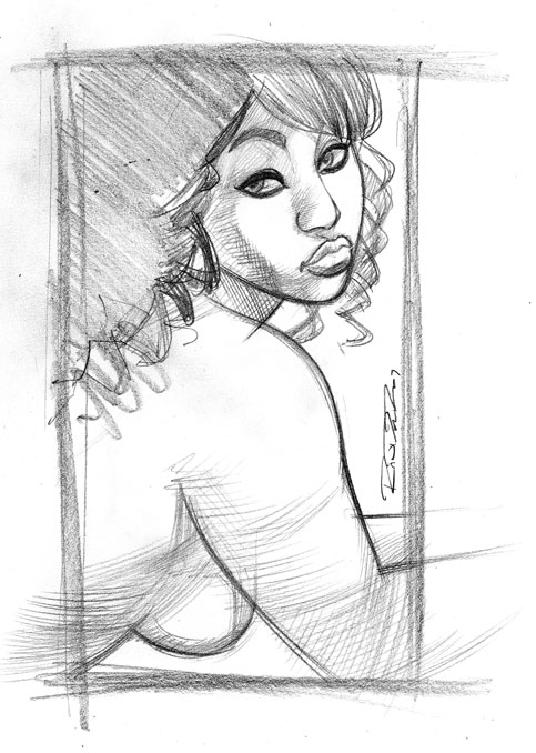
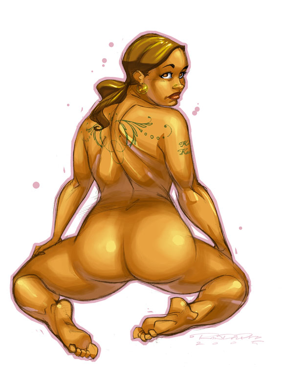
The name of my project is The Black Book. It will be a full color, 48 page hardcover artbook full of lovely ladies of all shapes, sizes and color. I'm maybe 85% done and super psyched about it. I hope to have it done and available for SDCC (hopefully) and Wizard World Chicago (definitely). After that, in stores and available thru Kharupt.com. I will share more info later, but until then, here are a few sneak peeks.
Thursday, April 12, 2007
Process: Sheena
No, not Shanna. Sheena. Queen of the Jungle. If you're old enough to remember the 80's, you might remember the movie that starred Tanya Roberts running around in the skimpy leopard bikini. Even as a little kid, I was like "yo. . . . . .that's hot." Anyways, that movie was based on the Sheena comic book that came out way back in the days. And now Devil's Due has the property, and they asked me to do a cover for the 1st issue. And me being me, I had absolutely no problem drawing a hot chick running around in a skimpy leopard bikini. I mean, c'mon. It's me. So this was the process.
Layout.
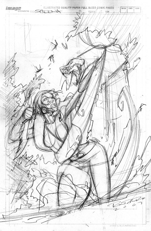
Whenever I do comic book stuff, the first step I do is do a layout on 8 1/2 x 11" paper. It looks like a comic book board only because I scanned in a board and placed it on 8 1/2" paper to get a better idea of how it will sit on the actual page. I sketch it out all rough type, trying to layout basic shapes, composition, making sure there is enough room for the title logo and indicia, and pass it off to the editor. I got approval (on the first sketch, woo hoo) with notes to make sure that the girl is blonde, but of a not too specific nationality. You know, sorta like Jessica Alba in the sense that you don't really know what the hell she is, she's just hot. Works for me.
Pencils.
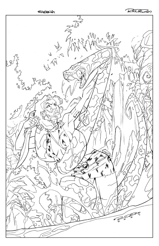
Now that's it's approved, I blow up the small sketch to 11 x 17", place it under my bristol, and lightbox it to create the clean lineart. Similar to the Chaor piece, there are no inks to this lineart, it's just blue pencil to rough in, and then F pencil to create the clean line. There are no spotted blacks used, as I have a very specific look I want the finished art to have, which is to basically look like an animation cell. This is also the reason there is very little deviation to the line art thickness. The background is a flat, dead line weight on purpose, because I want it to recede. The foreground figure has slightly more variety to line but only enough to push it to push it forward some.
Color.

Once again, the marvelous and talented Tony Washington makes me look good with the colors. Tony is so good I really didn't have much direction for him. I only told him two things: 1 - cell shading on the figure with painted backgrounds, and 2 - NO BLUE SKIES. Any colorist that works with me knows I absolutely hate blue skies. Hate them. They're the most boring thing in the world to me. But that's just me. You'll notice between step 2 and 3 her skirt changed some. As I was doing this Sheena's design was still being finalized and it was decided that her skirt was going to change from being a regular skirt to more of a triangular loincloth. So I quickly patched that up via Photoshop.
Revision.
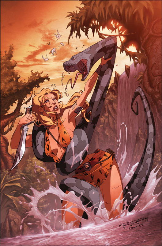
Like I said before, revisions are a part of life. Like death and taxes, know what I mean? So, everyone is like 99% happy with the product thus far. The one thing bugging everyone is, that somehow along the way from layout to pencil to color, she's just not all that cute anymore, lol. Like she's aged a couple years. This kinda stuff happens, where something looks cool in black and white but somehow once it gets to color it aint so cool anymore. So the editors asked me to go in and revise her face, making her a bit younger and cuter. I agreed. Deadline was approaching and I did what I could, but I'll be honest I'm still not 100% happy with her face. Oh well. You do the best you can with the time you have. The rest of it I really, really like however. And there you have it.
Sheena: Queen of the Jungle #1 will be out in June.
Layout.
Whenever I do comic book stuff, the first step I do is do a layout on 8 1/2 x 11" paper. It looks like a comic book board only because I scanned in a board and placed it on 8 1/2" paper to get a better idea of how it will sit on the actual page. I sketch it out all rough type, trying to layout basic shapes, composition, making sure there is enough room for the title logo and indicia, and pass it off to the editor. I got approval (on the first sketch, woo hoo) with notes to make sure that the girl is blonde, but of a not too specific nationality. You know, sorta like Jessica Alba in the sense that you don't really know what the hell she is, she's just hot. Works for me.
Pencils.
Now that's it's approved, I blow up the small sketch to 11 x 17", place it under my bristol, and lightbox it to create the clean lineart. Similar to the Chaor piece, there are no inks to this lineart, it's just blue pencil to rough in, and then F pencil to create the clean line. There are no spotted blacks used, as I have a very specific look I want the finished art to have, which is to basically look like an animation cell. This is also the reason there is very little deviation to the line art thickness. The background is a flat, dead line weight on purpose, because I want it to recede. The foreground figure has slightly more variety to line but only enough to push it to push it forward some.
Color.
Once again, the marvelous and talented Tony Washington makes me look good with the colors. Tony is so good I really didn't have much direction for him. I only told him two things: 1 - cell shading on the figure with painted backgrounds, and 2 - NO BLUE SKIES. Any colorist that works with me knows I absolutely hate blue skies. Hate them. They're the most boring thing in the world to me. But that's just me. You'll notice between step 2 and 3 her skirt changed some. As I was doing this Sheena's design was still being finalized and it was decided that her skirt was going to change from being a regular skirt to more of a triangular loincloth. So I quickly patched that up via Photoshop.
Revision.
Like I said before, revisions are a part of life. Like death and taxes, know what I mean? So, everyone is like 99% happy with the product thus far. The one thing bugging everyone is, that somehow along the way from layout to pencil to color, she's just not all that cute anymore, lol. Like she's aged a couple years. This kinda stuff happens, where something looks cool in black and white but somehow once it gets to color it aint so cool anymore. So the editors asked me to go in and revise her face, making her a bit younger and cuter. I agreed. Deadline was approaching and I did what I could, but I'll be honest I'm still not 100% happy with her face. Oh well. You do the best you can with the time you have. The rest of it I really, really like however. And there you have it.
Sheena: Queen of the Jungle #1 will be out in June.
Thursday, March 29, 2007
Random Ish
Can't speak too much at the moment, got a ton of stuff and no time to do it. So here you go y'all, a few con sketches and a few sketches just for the hell of it. Holla!


Monday, March 19, 2007
Process: Chaor.
Since this is my sketchblog, I figure I should show you guys some actual artwork, right? Ok. So this is something I plan on showing from time to time, the process that goes into creating some of the artwork I do. This particular piece is card artwork done for Chaotic, the property seen in my very first post. The character is Chaor, who is basically the baddest sumbitch in all of Chaotic. Don't mess with Chaor. So I start off every card by submitting a few different sketches and letting the client pick which one they wanna roll with.
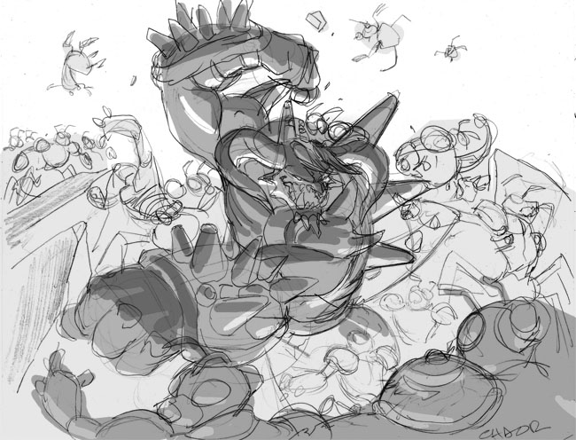
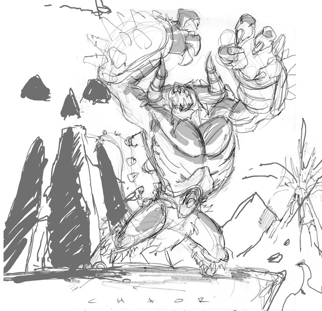 As you can see I try to stay very rough and loose with my sketches. One, because I'm really just trying to workout the composition and the design of the card. And two, I want the client to try and really feel the emotion and energy of what the final card will look like. If I went too clean and tight the lineart would start to stiffen up and would get even stiffer when I went to final cleanup.
After I did the quick pencil sketches I would go in and laydown some very quick greytones so that the sketches would be more legible to the client. It also helps me understand what kind of mood I would like to go for with the piece and it also helps the colorist as well so that we're both on the same page.
The client wound up preferring the second image because they felt that the first one was too busy and they wanted more of the focus to be on the character himself.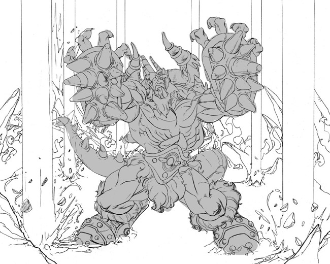
Next up is the clean lineart itself. I always have the most fun in this stage. Once the layout and composition is finalized, putting in all the details and crap is the easy part. You'll notice that I changed the character's body type significantly. I just didn't feel like he felt powerful enough with those tiny little legs of his, so I beefed him up and really tried to add some weight and mass to him. I specifically wanted his arms and his legs to look very "heavy," so if this dude hit you. . .well, you'd really feel it. It's stuff like that that really makes the character seem believable, even if it's completely made up. The background also changed some. The client wanted to highlite that this dude wasn't all brawn and had some magic capabilities so we decided to have him controlling the earth and raising lava geysers outta the ground. I didn't put any detail into the geysers themselves because I knew that they would be better represented by the color. One step I neglected to put in was the blue line stage of the lineart. When I do the clean line art, I start off with a blue pencil to rough in the lineart and get all the anatomy and and other stuff laid down. It's very messy. Once that is done I then go over the blue line with either an F or an HB pencil with a clean line. What this done is similar to inking, where I go for as clean and dark a line as possible. I use these specific pencils because the lead is still somewhat hard, but it's also a nice, crisp, dark line. After that is completed I then scan the lineart in and subtract the blue line via Photoshop and all that is left is the dark line. Voila.
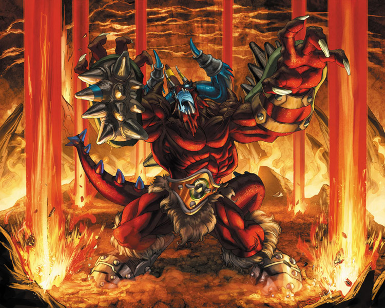 And now, the coolest part of all: the color. I got one of my most favorite of colorists, Tony Washington, to lay down the hues, and once again he really added another dimension to this piece and really brought it to life. Before T begins, he and I discuss what story needs to be told with the color and how we need to accomplish it. There are always somethings I want to tell, some he wants to tell, and some things the client wants, so it's always a bit of compromise on everyone's end. I wanted the underlighting that I previously laid down in the sketch, and T nailed it. He also added some incredible atmosphere with the earth texturing and the lava and really added a nice depth to it by making the air behind Chaor very thick. It really gives you the feeling that this guy is 100% evil. I was really happy with the way the color came out.
 And finally, corrections. There is almost always something that is asked for by the client to be changed. No matter how hard you try, it's a fact of life. The best you can hope for is that the corrections are minimal. Thankfully in this case they were. 4kids felt that his head, while dramatic, did not read clearly enough, especially since these images would be shrunk down to fit on a trading card. With stuff like this the operative word is "clarity," so if it doesnt read well at full size, it definitely will not read well on a card. So I redid his head. The only other real correction was that 4kids felt Chaor was a little too dark, so T went in and brightened him up a tad. Once that was done, it was a wrap. And there you have it.
As you can see I try to stay very rough and loose with my sketches. One, because I'm really just trying to workout the composition and the design of the card. And two, I want the client to try and really feel the emotion and energy of what the final card will look like. If I went too clean and tight the lineart would start to stiffen up and would get even stiffer when I went to final cleanup.After I did the quick pencil sketches I would go in and laydown some very quick greytones so that the sketches would be more legible to the client. It also helps me understand what kind of mood I would like to go for with the piece and it also helps the colorist as well so that we're both on the same page.
The client wound up preferring the second image because they felt that the first one was too busy and they wanted more of the focus to be on the character himself.
Next up is the clean lineart itself. I always have the most fun in this stage. Once the layout and composition is finalized, putting in all the details and crap is the easy part. You'll notice that I changed the character's body type significantly. I just didn't feel like he felt powerful enough with those tiny little legs of his, so I beefed him up and really tried to add some weight and mass to him. I specifically wanted his arms and his legs to look very "heavy," so if this dude hit you. . .well, you'd really feel it. It's stuff like that that really makes the character seem believable, even if it's completely made up. The background also changed some. The client wanted to highlite that this dude wasn't all brawn and had some magic capabilities so we decided to have him controlling the earth and raising lava geysers outta the ground. I didn't put any detail into the geysers themselves because I knew that they would be better represented by the color. One step I neglected to put in was the blue line stage of the lineart. When I do the clean line art, I start off with a blue pencil to rough in the lineart and get all the anatomy and and other stuff laid down. It's very messy. Once that is done I then go over the blue line with either an F or an HB pencil with a clean line. What this done is similar to inking, where I go for as clean and dark a line as possible. I use these specific pencils because the lead is still somewhat hard, but it's also a nice, crisp, dark line. After that is completed I then scan the lineart in and subtract the blue line via Photoshop and all that is left is the dark line. Voila.
And now, the coolest part of all: the color. I got one of my most favorite of colorists, Tony Washington, to lay down the hues, and once again he really added another dimension to this piece and really brought it to life. Before T begins, he and I discuss what story needs to be told with the color and how we need to accomplish it. There are always somethings I want to tell, some he wants to tell, and some things the client wants, so it's always a bit of compromise on everyone's end. I wanted the underlighting that I previously laid down in the sketch, and T nailed it. He also added some incredible atmosphere with the earth texturing and the lava and really added a nice depth to it by making the air behind Chaor very thick. It really gives you the feeling that this guy is 100% evil. I was really happy with the way the color came out.And finally, corrections. There is almost always something that is asked for by the client to be changed. No matter how hard you try, it's a fact of life. The best you can hope for is that the corrections are minimal. Thankfully in this case they were. 4kids felt that his head, while dramatic, did not read clearly enough, especially since these images would be shrunk down to fit on a trading card. With stuff like this the operative word is "clarity," so if it doesnt read well at full size, it definitely will not read well on a card. So I redid his head. The only other real correction was that 4kids felt Chaor was a little too dark, so T went in and brightened him up a tad. Once that was done, it was a wrap. And there you have it.Friday, March 16, 2007
Hellboy: Blood & Iron
Whattup y'all. Just sending out a quick reminder to let everyone know that Hellboy: Blood and Stone will be airing tomorrow (saturday) on Cartoon Network at 7pm. I didn't do much on the show, but I DID get to design one of the two main villains. If you watch, check out Erszebet. . . . that's all me, brotha.
Sunday, March 11, 2007
New York Comicon.
So, I finally, finally did it. I made an "official" blog. Not that I didn't have them before. I mean, I've had one on kharupt.com for years. And I have one on myspace. But till now I haven't been a part of the blog "community". And I felt a lil' left out. So here I be. And this is my first post. So, this being my first post, for those who don't know who I am, let me give you the short version. I'm Khary Randolph. I live in New York. I draw stuff for a living. I've done lots of work for companies like Marvel, DC, Image, Sony, 4kids, blah blah blah. And I love what I do. Every once in a while I crawl out of my little upper east side apartment (affectionately called The Hatch by me and my girl because it's dark and red and kinda looks like The Hatch from Lost) and go to comic book conventions. I go to these things 1) because it's one of the only times when I get to vibe with other creators and get amped up on all the amazing art; 2) I like to meet the fans and get honest reactions to the art; 3) and I say this with no shame whatsoever -- I make good money there. So with all that in mind, I did the New York Comicon February 23-35th, 2007. This one was a big one for me because it was the first time I had ever done signings at tables other than my own. I spent time at both the 4kids/Chaotic booth and at the McFarlane/Spawn. It was a -- wait. Stop. Let's cut all the blogginess out. Just look at the pictures already.
 The line. You can't really tell but this extended for blocks. And it was really, really cold outside.

 That's my artwork for Chaotic. It was posted on every door of the Javitz Center. Not bad, right?

 Me at my table. Notice the ashy hands of someone who washes his hands way too much.
And the bagel crumbs in my lap. Pimp.
 The Chaotic booth.
 My art.
 Yup. Mine too.
 Oh look is that? Yup. Mine.
 Signing autographs.
 Preaching the truth to the youth.
 Me and Spawn writer Jon Goff at the Mcfarlane booth.
 Me, Lesean Thomas, and a Pop Culture Shock girl.
 My good friend Lawrence Christmas. He's an angry black man.
 Andrew Bell, of Creatures in My Head. Yeah, he's gangsta like that.
 Me and my childhood homeboy Amit.
 She will probably kill me the next con I see her, but I cannot remember this girl's name for the life of me. Nonetheless, she was very cool and you should all go buy the book she's promoting.
 The fruits of a hard day's work. Holla!
Much thanx to everyone who contributed pictures to this blog. You guys keep me lookin' oh so pretty!
The line. You can't really tell but this extended for blocks. And it was really, really cold outside.That's my artwork for Chaotic. It was posted on every door of the Javitz Center. Not bad, right?Me at my table. Notice the ashy hands of someone who washes his hands way too much.And the bagel crumbs in my lap. Pimp.
The Chaotic booth.My art.Yup. Mine too.Oh look is that? Yup. Mine.Signing autographs.Preaching the truth to the youth.Me and Spawn writer Jon Goff at the Mcfarlane booth.Me, Lesean Thomas, and a Pop Culture Shock girl.My good friend Lawrence Christmas. He's an angry black man.Andrew Bell, of Creatures in My Head. Yeah, he's gangsta like that.Me and my childhood homeboy Amit. She will probably kill me the next con I see her, but I cannot remember this girl's name for the life of me. Nonetheless, she was very cool and you should all go buy the book she's promoting.The fruits of a hard day's work. Holla!Much thanx to everyone who contributed pictures to this blog. You guys keep me lookin' oh so pretty!
Subscribe to:
Posts (Atom)


