Layout.

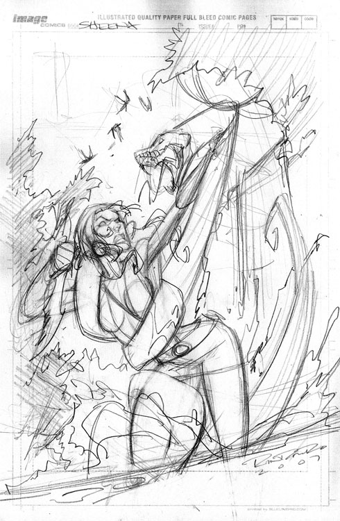
Whenever I do comic book stuff, the first step I do is do a layout on 8 1/2 x 11" paper. It looks like a comic book board only because I scanned in a board and placed it on 8 1/2" paper to get a better idea of how it will sit on the actual page. I sketch it out all rough type, trying to layout basic shapes, composition, making sure there is enough room for the title logo and indicia, and pass it off to the editor. I got approval (on the first sketch, woo hoo) with notes to make sure that the girl is blonde, but of a not too specific nationality. You know, sorta like Jessica Alba in the sense that you don't really know what the hell she is, she's just hot. Works for me.
Pencils.

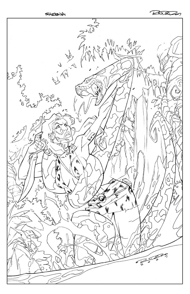
Now that's it's approved, I blow up the small sketch to 11 x 17", place it under my bristol, and lightbox it to create the clean lineart. Similar to the Chaor piece, there are no inks to this lineart, it's just blue pencil to rough in, and then F pencil to create the clean line. There are no spotted blacks used, as I have a very specific look I want the finished art to have, which is to basically look like an animation cell. This is also the reason there is very little deviation to the line art thickness. The background is a flat, dead line weight on purpose, because I want it to recede. The foreground figure has slightly more variety to line but only enough to push it to push it forward some.
Color.

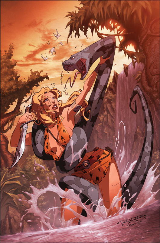
Once again, the marvelous and talented Tony Washington makes me look good with the colors. Tony is so good I really didn't have much direction for him. I only told him two things: 1 - cell shading on the figure with painted backgrounds, and 2 - NO BLUE SKIES. Any colorist that works with me knows I absolutely hate blue skies. Hate them. They're the most boring thing in the world to me. But that's just me. You'll notice between step 2 and 3 her skirt changed some. As I was doing this Sheena's design was still being finalized and it was decided that her skirt was going to change from being a regular skirt to more of a triangular loincloth. So I quickly patched that up via Photoshop.
Revision.

Like I said before, revisions are a part of life. Like death and taxes, know what I mean? So, everyone is like 99% happy with the product thus far. The one thing bugging everyone is, that somehow along the way from layout to pencil to color, she's just not all that cute anymore, lol. Like she's aged a couple years. This kinda stuff happens, where something looks cool in black and white but somehow once it gets to color it aint so cool anymore. So the editors asked me to go in and revise her face, making her a bit younger and cuter. I agreed. Deadline was approaching and I did what I could, but I'll be honest I'm still not 100% happy with her face. Oh well. You do the best you can with the time you have. The rest of it I really, really like however. And there you have it.
Sheena: Queen of the Jungle #1 will be out in June.


14 comments:
"yo. . . . . .that's hot."
and phattony is cool
Bout time you got a blog Kat, DAMN! I been looking for you on the Blog tip for the longest, lol. DOPE SHIT KID! PEACE!
Fire Kid!! Thanks for showing the process
Dang man You a sumbiiiiich.... This is hot and Tony threw down man!!! Great werk brotha!!-T
You is to cool for school son this is hot. Yo Tony's colors are off the hook you two really fit well together, Yall gotta do a comic or two one day.
Wow! This is amazing. I can't color for squat. The water is especially impressive. Great work!
great work!
too bad i missed you at the comic con coz you were signing at some other booth.:/
NICE!!! Thanks for breaking down the process. No matter how many times I see something like this I still manage to get inspired!
Khary is <3. Or Leopard print bikinis are <3. No. No, Khary is MORE <3.
I always love the way that snake wraps around, great composition K
i think it is perfect! she is dealing with some *ish at the moment she's not gonna look all cheerleader! love it. xoxo
Awesome that you posted the steps. It's great to see the inner workings of a piece. Great work on this one, kudos man.
Fantastic piece.
M!
Killer work man. Thanks for commenting on the blog. I always like seeing the process pics.
Post a Comment