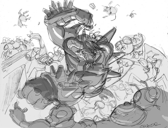
 As you can see I try to stay very rough and loose with my sketches. One, because I'm really just trying to workout the composition and the design of the card. And two, I want the client to try and really feel the emotion and energy of what the final card will look like. If I went too clean and tight the lineart would start to stiffen up and would get even stiffer when I went to final cleanup.
After I did the quick pencil sketches I would go in and laydown some very quick greytones so that the sketches would be more legible to the client. It also helps me understand what kind of mood I would like to go for with the piece and it also helps the colorist as well so that we're both on the same page.
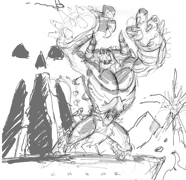
The client wound up preferring the second image because they felt that the first one was too busy and they wanted more of the focus to be on the character himself.
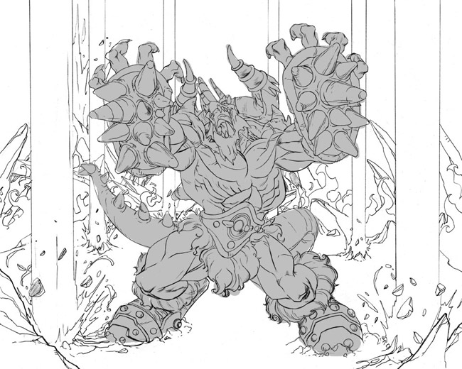
Next up is the clean lineart itself. I always have the most fun in this stage. Once the layout and composition is finalized, putting in all the details and crap is the easy part. You'll notice that I changed the character's body type significantly. I just didn't feel like he felt powerful enough with those tiny little legs of his, so I beefed him up and really tried to add some weight and mass to him. I specifically wanted his arms and his legs to look very "heavy," so if this dude hit you. . .well, you'd really feel it. It's stuff like that that really makes the character seem believable, even if it's completely made up. The background also changed some. The client wanted to highlite that this dude wasn't all brawn and had some magic capabilities so we decided to have him controlling the earth and raising lava geysers outta the ground. I didn't put any detail into the geysers themselves because I knew that they would be better represented by the color. One step I neglected to put in was the blue line stage of the lineart. When I do the clean line art, I start off with a blue pencil to rough in the lineart and get all the anatomy and and other stuff laid down. It's very messy. Once that is done I then go over the blue line with either an F or an HB pencil with a clean line. What this done is similar to inking, where I go for as clean and dark a line as possible. I use these specific pencils because the lead is still somewhat hard, but it's also a nice, crisp, dark line. After that is completed I then scan the lineart in and subtract the blue line via Photoshop and all that is left is the dark line. Voila.
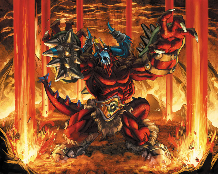 And now, the coolest part of all: the color. I got one of my most favorite of colorists, Tony Washington, to lay down the hues, and once again he really added another dimension to this piece and really brought it to life. Before T begins, he and I discuss what story needs to be told with the color and how we need to accomplish it. There are always somethings I want to tell, some he wants to tell, and some things the client wants, so it's always a bit of compromise on everyone's end. I wanted the underlighting that I previously laid down in the sketch, and T nailed it. He also added some incredible atmosphere with the earth texturing and the lava and really added a nice depth to it by making the air behind Chaor very thick. It really gives you the feeling that this guy is 100% evil. I was really happy with the way the color came out.
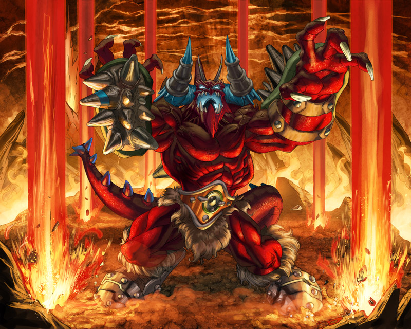 And finally, corrections. There is almost always something that is asked for by the client to be changed. No matter how hard you try, it's a fact of life. The best you can hope for is that the corrections are minimal. Thankfully in this case they were. 4kids felt that his head, while dramatic, did not read clearly enough, especially since these images would be shrunk down to fit on a trading card. With stuff like this the operative word is "clarity," so if it doesnt read well at full size, it definitely will not read well on a card. So I redid his head. The only other real correction was that 4kids felt Chaor was a little too dark, so T went in and brightened him up a tad. Once that was done, it was a wrap. And there you have it.


8 comments:
Cool stuff homie. This to me is the best aspect of drawing just creating a character from scratch and seeing the end result.
Awesome kharupt, I just got taken to school.
saved to favs
be back for more
and i know tony "T" or aka phattony
rulz
hey tio eres un genio, dibujas que te cagas un saludito
WOW!! AWESOME!! Great to see the work in progress!
The True Master!
More, bitch! MORE!!!
These images from Chaor are precious! Specially the dark color "turned head" one!
It's my favorite! And I searched along! Thank you!
Post a Comment